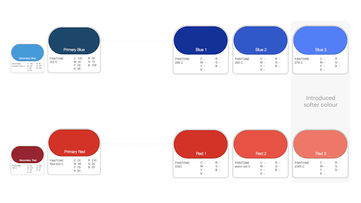
Connecting the past with colours of progress. New shades of blue and red softened Capitec’s corporate feel while maintaining its iconic look.
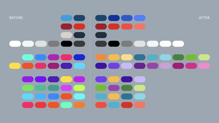
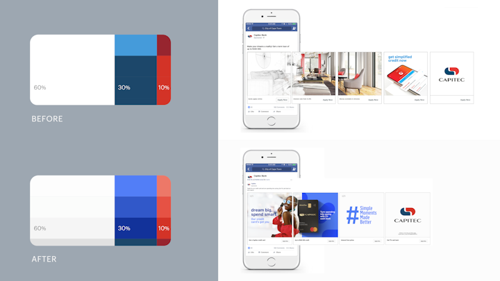
A refreshed palette for both the MoneyUp and Live Better properties, and the internal brand added versatility.
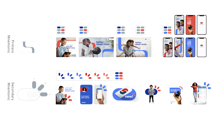
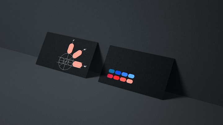
Graphic mnemonics designed to support, not overshadow.
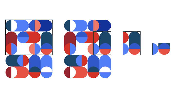
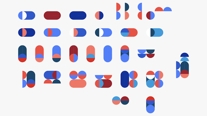
Simplifying the pattern created the deconstructed building blocks.
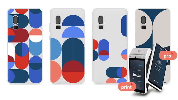
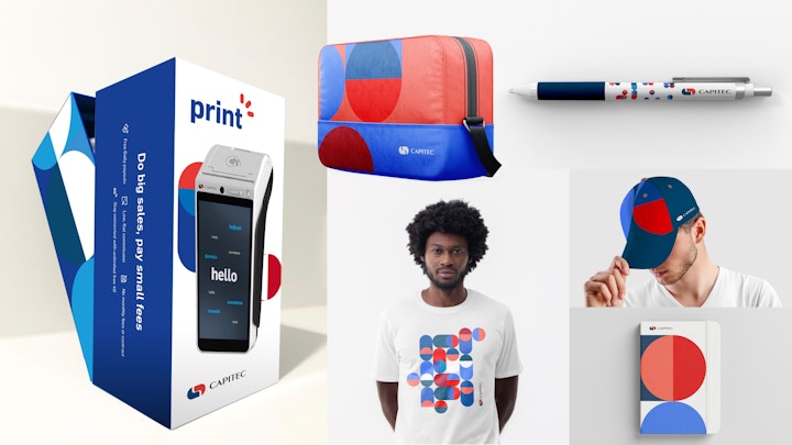
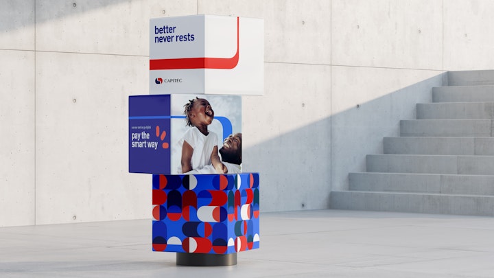
Bespoke patterns from the building blocks added texture to event branding, packaging, and merchandise.
Building the future while honouring the past
Capitec’s identity had fragmented over a decade of growth, with various "add-ons" like Live Better and Business Banking diluting its core branding. Competitors mimicked Capitec’s marketing style, so the brand struggled to retain its distinctiveness.
The brand refresh sought to modernise Capitec’s visual identity while safeguarding its legacy. It aimed to maintain the brand’s simplicity and human touch, countering an increasingly corporate and clinical image. The goal was to create a cohesive, flexible design system that resonated across retail and business banking, delivering a consistent and adaptable solution for varied platforms and departments.
Capitec’s legacy design elements, such as its lozenge-shaped icons and minimalist style, were strengths to be evolved rather than replaced. By extending these elements, the team created a fresh yet familiar visual identity.
| –– Bringing it all together Creative Director: Russell Petrie Design Partners: Promise Group & Fierce Global |