The brandmark evolved twice. First in 2009 with the relaunch, then in 2017 when “bank” was dropped.


The brand’s early visual language centred on 3D icons. That changed in 2016 with the launch of Live Better and the rise of digital campaigns, which required more lifestyle imagery.


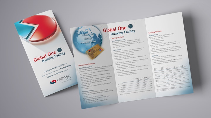
From globe icons and wordmarks to a simple identifier. As the brand shifted from print to digital, the design evolved for clarity, consistency and ease of use.


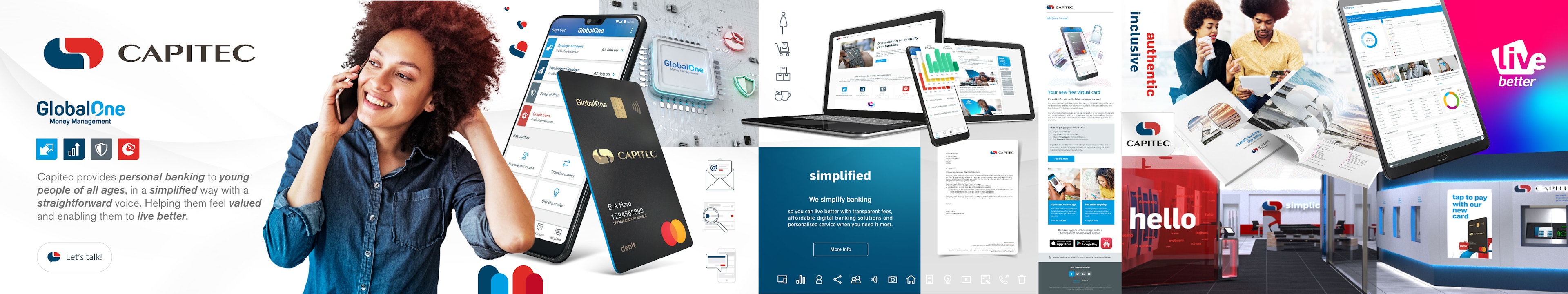
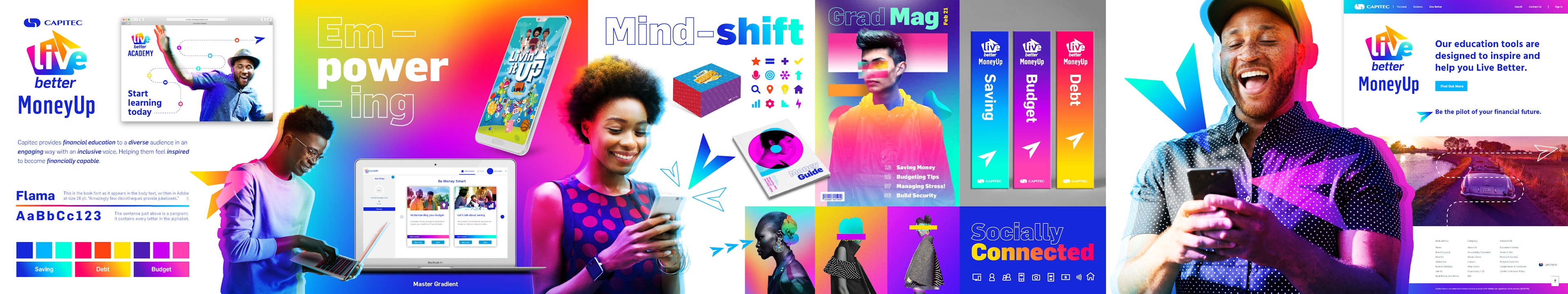
From campaign line to brand property. Live Better simplified into a focused rewards platform, while financial education moved under the MoneyUp property through MoneyUp Academy and MoneyUp Chat.
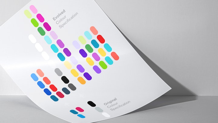
Initially just red and blue, the colour palette evolved to support retail and business banking, the Live Better and MoneyUp properties, and the internal brand. The internal colour system, shaped by Capitec’s four fundamentals, became a quiet expression of what sets the brand apart.

From the original gold cards to today’s vertical black format, design has evolved with intent. By the end of 2024, Capitec had produced over 100 million cards.
Evolving with intent, staying rooted in simplicity
Simplicity was never about doing less. It was a deliberate, strategic choice.
Between 2008 and 2024, the brand evolved with intent. Not to follow trends, but to sharpen focus. Each shift was purposeful, designed to improve clarity, reduce noise and reflect a growing maturity.
What emerged was a more refined, confident identity. Still functional. Still simple. But more considered in every detail.
Because simplicity, when done well, creates space for meaning.
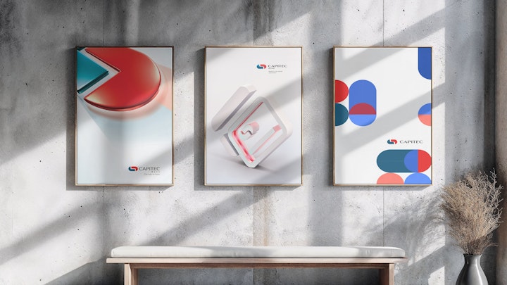
Stylescapes


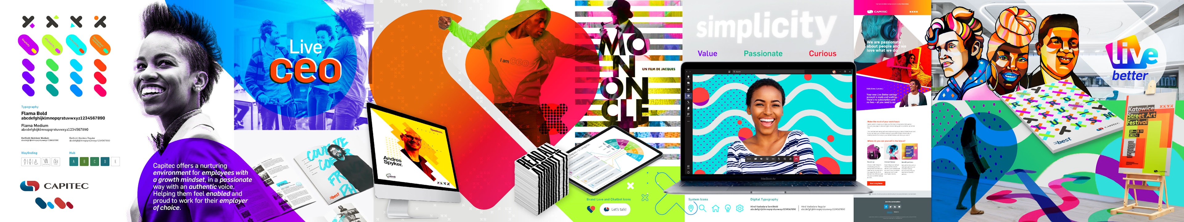
These stylescapes captured the visual direction for each brand area, including retail, business banking, Live Better, MoneyUp and the internal brand. They were used to align teams before delivery began. While now outdated by the work landed in 2024, they will be updated to guide future development.